Attribute types
When adding a new object attribute, you can choose between the following attribute types.
Warning
You cannot change the attribute format / type as soon as it is applied. If you no longer need an object attribute, consider disabling it instead of removing.
Note
What about the translation of my attributes?
For some attribute types you can decide if they should be translatable or not. To be precise, it works only for the selectable fields because the possible choices are known and limited. For the following attribute types, you can set the translatable flag:
Boolean field
Single selection field
Multiple selection field
Single tree selection field
Multiple tree selection field
For these types, you can find an additional field Translate field contents:
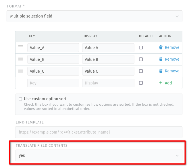
Screenshot with example of translatable attribute type
- Boolean field
Provides a drop-down field with display values for
trueandfalse. Setting a default is mandatory.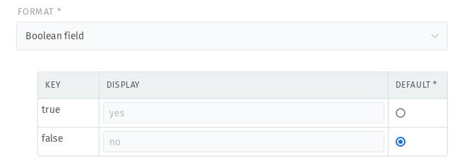
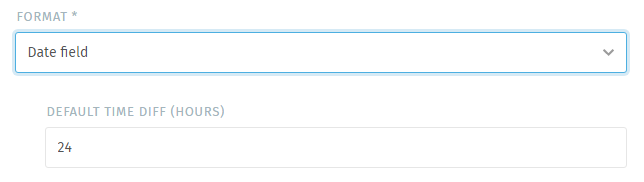
- Date field
Provides a date picker field and does not allow default values.
- Default time diff (hours)
This setting helps the user by highlighting the day from now plus the provided value. It does not pre-fill the field.
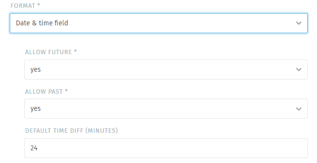
- Date & time field
Provides a date and time picker – does not allow default values
- Allow future
- Forbid dates and times in the future.Default:
yes - Allow past
- Forbid dates and times in the past.Default:
yes - Default time diff (minutes)
This setting helps the user by highlighting the day from now plus the provided value. It does not pre-fill the field.
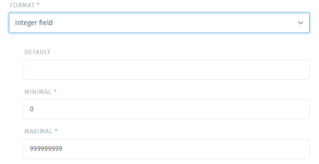
- Integer field
Provides an input field that allows integer usage only. You may define a default value. You cannot enforce comma separation.
- Minimal
The minimal value the field accepts.
- Maximal
The maximum value the field accepts.
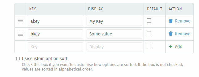
- Multiple selection field
Provides a selection field that allows the selection of one or more out of several. This field does allow setting a default value.
Tip
Adding values can be tricky for first timers, don’t forget to press “➕ Add” after typing your values. Otherwise you may loose a value.
Hint
This field allows using URL fields (Link Templates).
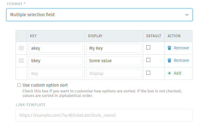
Tip
↕️ This field type allows the positioning of its values ↔️
In order to re-arrange the field values, edit the field and scroll below the values. Make sure to tick the option “Use custom option sort”.
Warning
If you do not tick this field, all manual positioning you did above will be lost upon saving! ☠️
Now use ☰ to drag the values in question to the correct position. When you’re ready, submit your changes to save the object attribute.
- Single selection field
Provides a drop-down field that allows selection of one value out of several. This field does allow setting a default value.
Tip
Adding values can be tricky for first timers, don’t forget to press “➕ Add” after typing your values. Otherwise you may loose a value.
Hint
This field allows using URL fields (Link Templates).
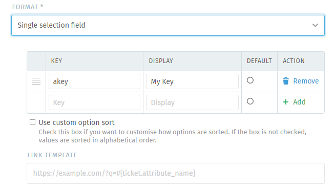
Tip
↕️ This field type allows the positioning of its values ↔️
In order to re-arrange the field values, edit the field and scroll below the values. Make sure to tick the option “Use custom option sort”.
Warning
If you do not tick this field, all manual positioning you did above will be lost upon saving! ☠️
Now use ☰ to drag the values in question to the correct position. When you’re ready, submit your changes to save the object attribute.
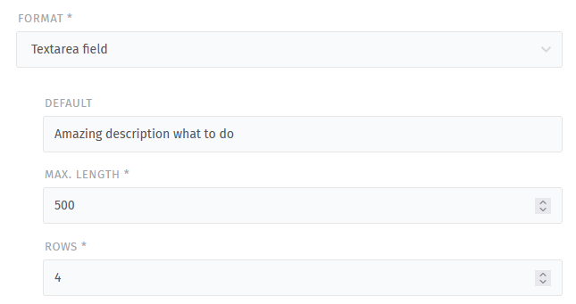
- Textarea field
Provides a text area input field (multiple lines) and thus allows e.g. new lines. You can set a default field value.
Note
Please note that this field does not support text formatting or HTML content (rich text).
Warning
🥵 This field can consume a lot of visual space
Depending on where you use this field type, it may use a lot of visual space if you provide a lot of text. This may be an issue to work with.
- Default
The here provided text will be shown within the text area field or new data sets.
- Maxlength
- You can pick the maximum length of the field.The default length of this object is
500. - Rows
- Change the number of rows to dislay so that you can use only the space you really need.The default number of rows is
4.
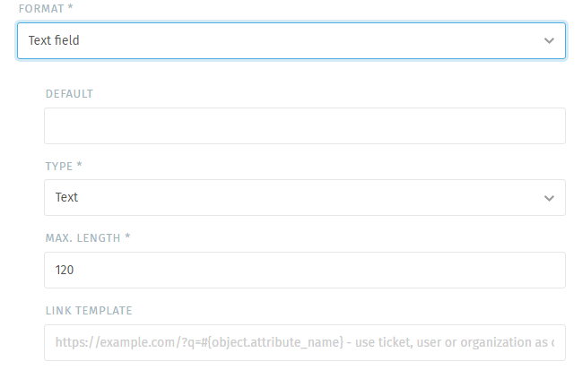
- Text field
Provides a text field (one line) and allows choosing a default value.
- Type
Defines the type of the input field. This allows e.g. your browser to ensure that you provide the specific type.
Currently available:
Email
Phone
Text
Url (URL fields disable link-template availability)
- Maxlength
You can pick the maximum length of the field.
Hint
This field allows using URL fields (Link Templates).
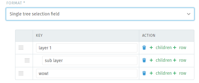
- Single tree selection field
Provides a select-like field with up to 6 layers of options. Does not allow setting a default value.
Tip
↕️ This field type allows the positioning of its values ↔️
In order to re-arrange the field values, first edit the field. Then you can use ☰ to drag the values in question to the correct position. If you want to change the layer depth, double click on ☰. With it you can cycle through the available layers.
When you’re ready, submit your changes to save the object attribute.
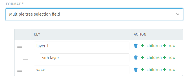
- Multiple tree selection field
Provides a select-like field with up to 6 layers of options allowing the selection of multiple values. Does not allow setting a default value.
Tip
↕️ This field type allows the positioning of its values ↔️
In order to re-arrange the field values, first edit the field. Then you can use ☰ to drag the values in question to the correct position. If you want to change the layer depth, double click on ☰. With it you can cycle through the available layers.
When you’re ready, submit your changes to save the object attribute.
- External Data Source field
Provides a searchable field which fetches data from an external system. This can be useful if you have data outside of Zammad and don’t want to maintain both data sources.
The feature works as follows:
Zammad sends a query with a search string (free text from agent or based on a variable) in a pre-defined format (“Search URL”) to an external system.
This external system searches for matches and provides a response as a JSON structure to Zammad.
Zammad just looks for the defined list and value keys, reads the content and displays the value to the user. There is no search on Zammad side.
Warning
The usage of a PostgreSQL database for Zammad is required. In any other case, Zammad will hide the external data source type and you are not able to use it. If you want to use this feature, consider to migrate your database.
Currently, only
GETis supported as request method.The data structure must be in JSON format and provide the objects in an array.
The endpoint for the external data source has to support search. On Zammad side, there is no search/logic implemented; however, you can define the output key and value based on the result(s) from the response (which provides already filtered content based on the search).
If you receive more results as expected, your external data source search may not work properly or the structure of the URL is not correct. You should get in touch with a responsible person from the external system.
Please have a look at our example, where you can find a possible configuration for a public dummy endpoint.
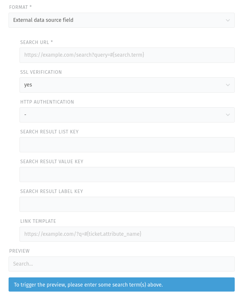
- Search URL
Set your endpoint where Zammad fetches the data. Please make sure to include a valid search variable as an URL parameter. Example for a free text search at user input:
#{search.term}If in doubt, ask the responsible person for the external data source how they expect the strucuture of the URL.
Note
Depending on your search variable, the preview might work or not. The reason is that the context might not be available and it is no bug.
Please also make sure to use a variable which is available in your object context. For example you won’t be able to search for a ticket in a user object context.
- SSL Verification
Here you can switch the SSL verification to no.
Danger
Please be aware that turning off SSL verification is a security risk. It should only be used temporarily or for testing purposes. If turned off, there is no verification of the certificate, which means that any presented certificate will be accepted.
If your external data source system is using self signed certificates, please have a look here for further information about how to handle them in Zammad, so you can keep the SSL verification activated.
- HTTP Authentication
If your external data source requires an authentication, you can set it here. You can leave it empty or choose between Basic Authentication or Authentication Token (selecting one of the two methods leads to additional fields where you can enter your credentials/token).
- Search result list key
Defines the level in the JSON structure which provides the list with search results. You can leave it empty, if the data is already provided as an array. If you have to go deeper in the structure, you can provide a path with
.as separators, e.g.key.subkey.sub-sub-key.- Search result value key
Defines the attribute in the structure in which your external data source provides the value for your data. An example would be a product number. If you have to go deeper in the structure, you can provide a path with
.as separators, e.g.key.subkey.sub-sub-key.- Search result label key
Defines the attribute in the structure in which your external data source provides the label for your data. An example would be a product name. If you have to go deeper in the structure, you can provide a path with
.as separators, e.g.key.subkey.sub-sub-key.- Preview
In the preview area, you can find the following items (depending on your configuration above):
Error/hint message (only if configuration is not complete): Zammad tells you, if there is a problem and what you should change in your configuration.
Search field: search for an existing attribute in the data source to get a preview. This is required for the fields below to show up.
Search result response (only if configuration is not complete): here you can find a syntax highlighted JSON preview of the response, based on the search term you entered.
Search result list (only if search result list key is properly set): output of the structure under the configured search result list key.
Preview table (when fully configured): Zammad shows you a table which includes the found items based on the search string (value, label and optional link). You can use this preview if you don’t have the complete data structure of the external system in mind.
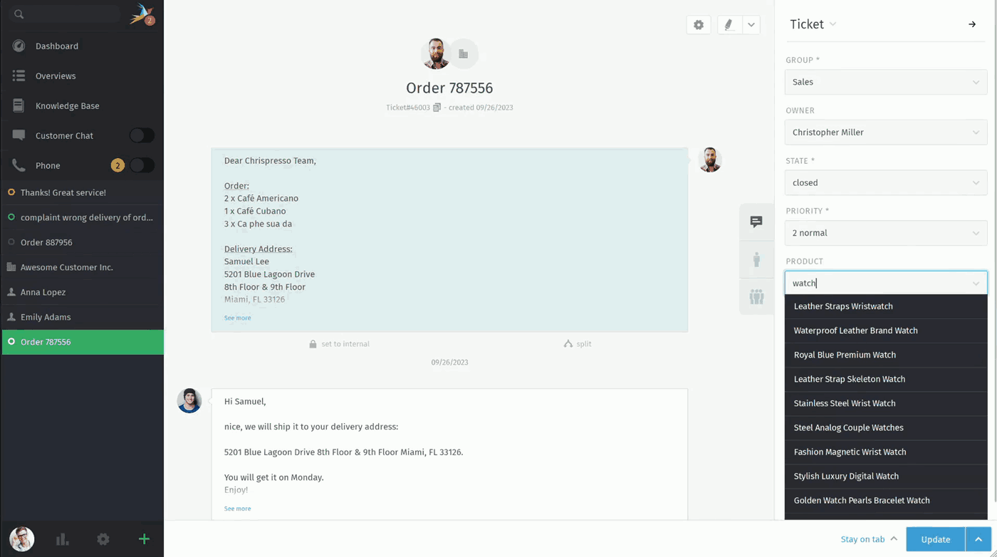
An example of a configured external data source field from agent perspective:
URL fields (Link-Template)
Note
This function is restricted to Text, Select and External data source types only.
Link-Templates are an amazing way to dynamically generate URLs. They allow you to integrate other systems better without having to manually copy data from Zammad if possible.
Note
Another great way of communicating with another system may be Zammad’s Webhooks.
After filling a link-template enabled field, an URL icon will appear on its right. Clicking on the icon opens a new tab.
Hint
Even though Zammad displays the link template within object edit and create screens, the function is optional. It’s only active if you populate the field.
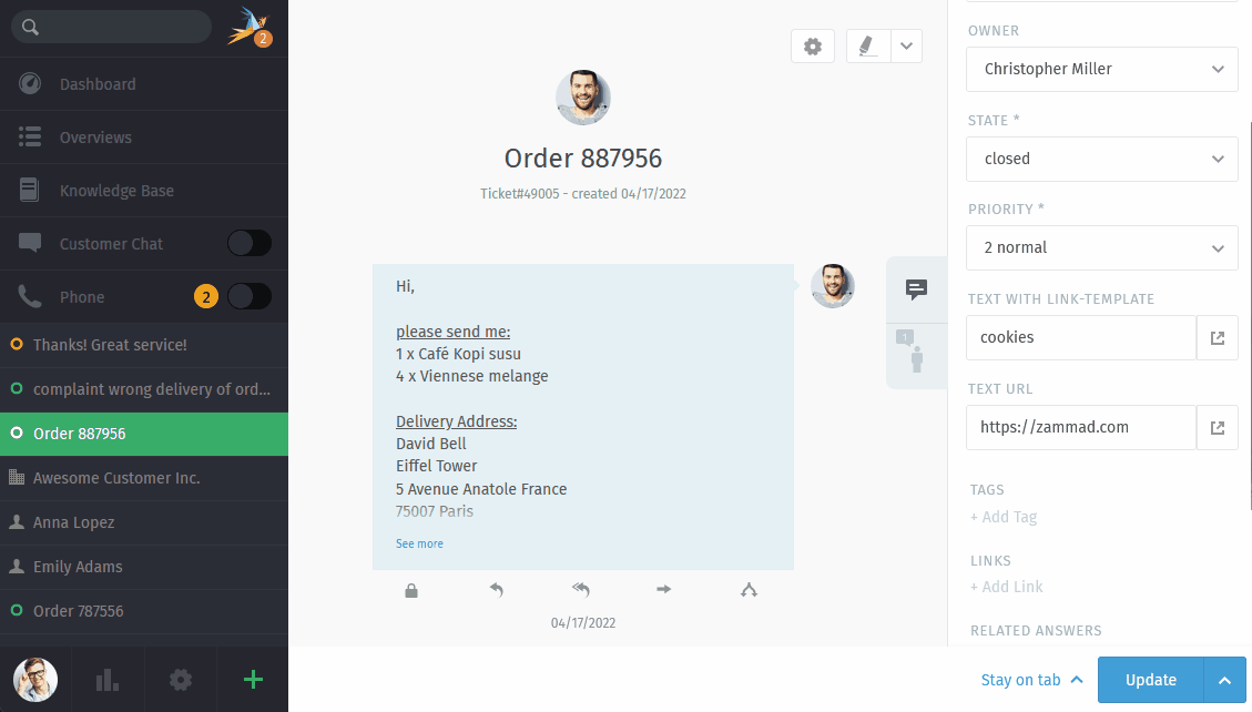
What’s the difference between URL and text fields with link template…?!
Both fields have different use cases.
Use text type text fields when ever you have a static url that requires
dynamic parameters. If you require a drag & drop like field that you can put in
any URL, use URL type text fields.
The difference is easier to spot when comparing the fields directly,
below screencast shows the result - the dynamic approach uses existing values
in the moment of updating to built the URL - e.g.
https://google.com/search?q=cookies - while the URL approach uses the
actual URL of the field - e.g. https://zammad.com.
How does this work…?!
As an example, let’s say you have an attribute called amazing_attribute and
you want to open a google search directly with the input from that field.
Providing the link-template field below allows you to do so:
https://www.google.com/search?q=#{ticket.amazing_attribute}
Tip
You can use any Zammad variable as long as it’s available in the moment you need it.
As a result, you are redirected to Google with a search for the value of the attribute, if you click on the button in the ticket (as you can see in the screencast above).